I’ve thrown together a Gantt chart and I want to add a “peak” portion in the middle of each bar. So each bar represents a project… let’s say for example Project A lasts from 4/1/14 through 4/15/14. Well I want that bar to be a light color, aside from the “peak” portion that’s a shade darker… let’s say 4/7/14 through 4/9/14. So each bar would show the entire time that the project is “active” but it will also show where a team member is busiest with that project.This is what the original looked like

The data included the project start and end dates along with a peak start and end date. These dates were used to create two calculated fields for Project Duration and Peak Duration.
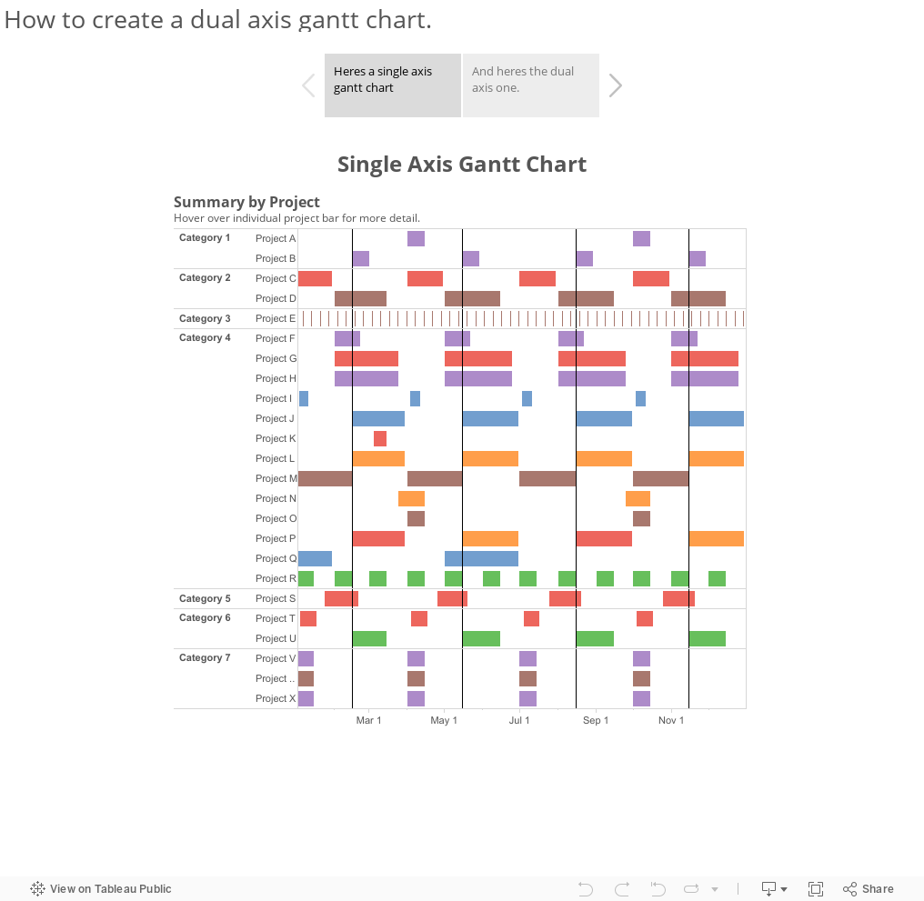
My initial thought was could you create a dual axis gantt chart and overlay the peak durations over the top of the project durations already on the chart.
First right drag the Peak begin date to the column shelf and select the continuous day.

Next select dual axis and then synchronise the axis so that the two sets of marks overlap each other.
At the moment the peak gantt chart is using the project duration as the length of the bars so drag the peak duration measure onto the size shelf of the Peak Begin chart.

Finally change the transparency of the colours of the project gantt so that they are a lighter shade

And now your chart should look something like this