Tuesday 11 October 2016

Why are my Tableau server extracts failing?

This is the first in a planned series where I document my adventures in the exciting world of Tableau server. I've been using Tableau server ever since I first found Tableau, but for the first time, I am getting into the admin side of things. I might even end up going on training for it, now that's serious! 

Anyhow one of the first tasks I have been asked to look at is monitoring the server. Now Tableau comes with some dashboards to look at things like user activity, disk space and extracts. These do a pretty good job of saying what's currently going on, but you soon find out that you need a bit more information and that's the point of these posts, to walk through what I needed and how I did it. 

First up, Extracts


We use lots of extracts on our server for a number of reasons. A lot of our data is not from fast warehouses, in a lot of cases, it's from the live databases so we need a way to get the data and make sure that the user interaction in the dashboards is as fast as possible, so that's why we extract. When looking at the extracts I have got 3 tasks that I want to do


  1. Identify and fix all failing extracts, find those one-off errors and put measures in place to stop them happening again. Fix those that are constantly failing due to connection passwords changing etc. 
  2. Once all the failures have been addressed the next step is to look at usage, how many of these extracts are being used, what's the total number of monthly views , what is the size. Those old extracts can be turned off to reduce load and space on the server and remove duplicates
  3. Now we just have the extracts that are needed, they don't fail so the final step is to optimise them, reduce the complexity, increase performance, and tune them up. 
  4. Use the new v10 alerts function to tell users when their extracts have failed so that they can monitor it themselves. Self service FTW!


So the first little issue is over failing extracts. Tableau server comes with a nice little dashboard that shows "How Have Extracts Performed on This Sever" and it lets you select some filters and find extracts that have fallen over or that have taken a long time. The first job I have been asked to do is find out why these are failing and either fix them or at least know what's going on. 

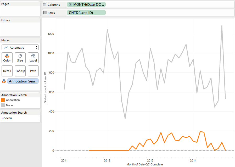
So what I can see is that we have roughly 100 failures every day,now is that good or bad? Are that 100 extracts failing once, or one extract failing 100 times. Are they old or new, are they even being used any more? Like most things related to Tableau, one answer always leads to more questions. There is a separate tab to look at the amount of traffic to a data source, but then that wouldn't list the ones that have failed. As this is a pretty specific query it looks like I'll have to build my own dashboard to assist. And that's never a bad thing, always nice to roll up the sleeves and build something.  

I've connected to the Tableau internal postgresDB and looked at the _backgroundjobs view, which lists all the jobs that have been running, including those extracts that have failed. Then by joining to the _datasources I can build a dashboard that shows me all the jobs for the past month, whether they have passed or failed. I can see the total number of jobs and the number that have failed for the past 7 days, are they going up or down and what proportion fail. This is important as a top level metric, the numbers that the Team Leaders are going to want to see decreasing. 
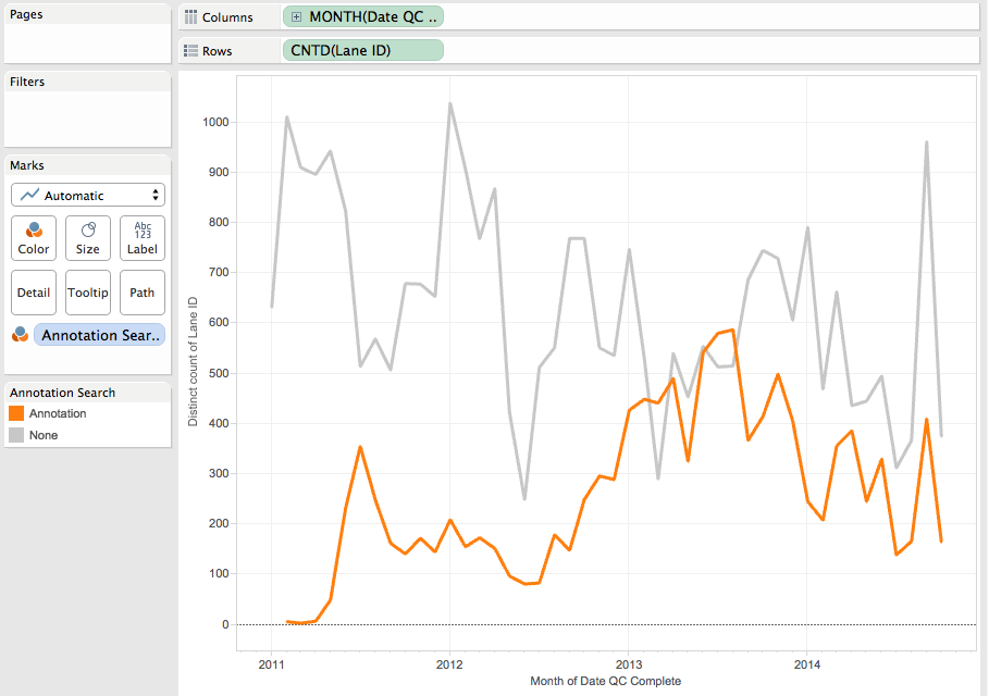
But crucially, we need to know whether the failing extract was a one-off or if it's always failed or something that has recently fallen over. It's this that's the important thing to look at with any error. Problems like disk space, they might come and go as old data gets pruned but changes to database names might be reoccurring issue. Just getting a list of the current fails doesn't give enough information. I've added the grey bars using reference lines to show today in dark grey and the last 7 days in the lighter grey so that it tied it back to the overview bar charts at the top. This also helps to quickly see if the issues are recent of have been going on for days or weeks. 


Then, of course, the next step is, so this extract is failing, but what is the error, who published it, when did it last correctly run and is it even being used anymore. All this comes from the postgresDB and added to the tooltip

So now I have a single dashboard that in a glance I can see if we have site-wide issues, local project issues, a re-occurring issue that needs intervention, or just a blip that will sort itself out. 

Once I have all the monitoring dashboards in place to check that things are not failing, I can then go on to the next step and look at usage, remove those that are not needed anymore, and then finally tune those that are. 

If these next steps go as well as the first, then I will have made a huge step in getting the server under my command. Muhahahah


Tuesday 2 August 2016

How to filter data when you don't have the data?


Filters in Tableau are great, they let you get rid of data that you are not interested in a hone in on the data that you do. They do however have one big flaw. You can only create a filter if you have the data. What do I mean by this? Well lets look at an example. 


We want to create a sales dashboard per state. Our sales areas are divided by regions and we want to create sales dashboards one that just looks at just one region at a time Central,West,East and South.

So we could do that using a filter right? Well lets see what filter options we have. Dragging region onto the filter shelf shows us this


We only have 3 regions to choose from, its not possible to select the West region. The reason for that is that filters Only filter the values in our data. If the data isn't present, we cannot filter it out. We haven't yet had any sales for the West region, so we don't yet have that in our data, so we cannot create a filter on it yet. We do know though, that we will be getting data for it, so how can we set up filtering for data that we haven't got yet?

So what do we do in this instance? Well we can create the East/South/Central dashboard as those three regions are present in the data, but what about the West?


Well we could use and exclude filter and select East/South/Central to be excluded, leaving the other two regions. Then when we do get the sales for West arrive in the data the filter will still work and our dashboard will filter the data. 

But, and its a big but, the sort that Sir Mixalot would like, are we certain no more regions would ever be added? What would happen if a North region got created and data started to be associated with a North region? Well the East/South/West dashboards would be fine, its including the East,West and South regions so any new regions would just be ignored. However, what happens to the West? That filter is only excluding Central,East and South, any other value of Region is welcome. This means that the North region data will be included, silently. Using Exclude filters are only good if you don't care about extra data being added, sometimes that what you want, but its better to include if possible. 

So, theres the problem, how can we create a filter for data that isn't yet in our data source? The answer like most things is parameters. 


We need to create a parameter and then tell Tableau to match it to the Regions and then add that to the filters. 

First, lets create a Region parameter


Now we create a calculated field based on the value of the parameter. 


Add this to the filter shelf


and then test it out.


We can now select a region and the filter works. When we select West, we get a blank sheet, which is correct, there is no data, so nothing is going to be shown. However, when the West's data starts to get added this filter will become "active" and only show the wests data. 

Parameters are a great way to take control of your data viz, you can ensure that filters work how they should and that the only the data that you want to be seen, is seen. 


Wednesday 27 July 2016

Don't use network drives with Tableau, use Network Locations

We have users that need to use Excel workbooks as datasources in their Tableau dashboards which are then published to Tableau server. However the problem lies with how Windows and Tableau use the network path names. 
Most people will connect to a shared drive by mapping a network drive, like this


And map the network drive to a letter, in this case Z. 


Now all that works fine and Tableau desktop will happily connect and all is right in the world. But if you then publish that workbook to the server, the problem arises with that drive letter. Tableau server has no idea what that Z drive is, it thinks it's a local drive on the server box somewhere and so it cannot find the correct file. This makes for a sad panda.


Instead we need to make sure that Tableau uses the UNC path name. The UNC path in this example is \\fastnfs\tableau_data_sources, the same that we used when we mapped the drive to the letter Z. 

Even though from here it knows the UNC path..


You can see the path that the data source is using by right clicking on the name in the data window and selecting properties


and if we click on the filename in the data connection window we can see it's defaulted back to use the drive letter. 


To fix this we need to edit that path to be the full UNC one


And then if we publish, Tableau server knows where to go and look for the file, assuming you have giving the Tableau Services user access to the directory.

This all works fine, except it relies on someone remembering to manual edit the path name to the full UNC path and not the driver letter name. 

The good news is that there is an easy solution to this and it's how you set up your access to the shared network drive in the first place. Instead mapping a network drive you map a network location. The process is the same as mapping a drive, except it doesn't get a drive letter. 


Choose the custom network location, click next.

Put in the UNC path for your shared drive


Give it a name


click finish and voila


We now have a new network location, note the different icon. 

Now if we create a data connection and use that instead of a lettered drive


And then check the data source properties we see it's got the correct UNC path, we havent typed a thing, not had to edit anything. 


Hope this helps anyone using files on a network share as a data source, if you need any help setting this up, just give me a shout. 

Thursday 7 July 2016

A Quick way to display decades on a continuous axis without a calculation

During #Zensontour we did #Makeovermonday using the Global Temperature data from week 20. This has the median temperatures per month. Plotting it as a line chart gives something like this 


But what i wanted was to have the decades displayed on the axis. I could use a calculated field to create the decades

STR((INT((Year([Date]))/10))*10)+ "'s"

This then gives you a decade dimension that you can add which then gives you this


But what i really want is the label of decades on the axis, but with a continuous line. Well you can do that, without a calculation, by editing the axis labels.

So first, get rid of the decade, change the year to a green pill, a continuous year.


Now right click on the Year of Date axis and click on the tick marks tab


We then change it to be fixed, every 10 years, and then set the tick origin to be 1/1/1840


Click ok and you then get this


And whats really cool is that if we drill down, we still get the decades on the axis. 


Quick, easy and no calculations. 


Monday 14 March 2016

Busting the DataViz Myths one by one

Well its been a long time but here i am blogging again. Its been a busy few months, which i will be blogging about in due course but first i want to introduce to you my new site

http://www.datavizmyths.com/

So what is this new site about i hear you ask? Well i am glad you asked.

There are many rules and guidelines around dataviz. Everyone knows the rule, but not necessarily the origin and the logic behind it. What started out as a guideline becomes a rule that gets blindly followed without understanding why. Over time, these rules become mantras and doctrine that people follow religiously, and enforce when they see others straying from the path. However as their origins have been lost in the mists of time, often this advice or criticism is un-warranted.
 This website aims to explore the myths surrounding dataviz and look for the truth behind them. To show what the rule actually means, when to apply it and when to disregard it. I want to show that it’s not enough to just know the rule, you have to know the reason why it exists in the first place, know when to bend it and not break it.

Over time i will add more myths to the list, the aim is for this to become the dataviz myth busting reference site. So, if you have a myth that you want exploring and ultimately busting, let me know.

Sunday 4 October 2015

The Challenge With Visualising Gun Deaths in the US


A few days ago President Obama asked the worlds media to do a dataviz for him. He asked them to show the number of deaths due to terrorism compared to the number of deaths due to guns. This was prompted by the most recent mass shooting in the US. The response has been amazing, my twitter feed filled up with chart after chart showing the massive difference between terrorism and gun crime such as this one made by Vox.com


Then people went on and created a whole range of vizzes based around gun homicides, gun laws, differences between states and countries. There are bar charts, maps, static, interactive, in every shape colour and size. One of the best that I have seen was by Andy Kriebel.


I was planning on making a viz and then it occurred to me, what was the point. Would it make a difference? Would it change anything? And the answer is, probably not. All of the vizzes coming out show something that everyone already knows. America has a serious gun problem, but no idea how to solve it. The bigger problem though is that by visualising the data, it sanitises the underlying data. Rob Radburn talked about this at his talk at the London Tableau Roadshow, where he said that it's not just pixels on a screen, there are real people behind this data. 

Europe is in the midst of a migrant crisis. Thousands of people are fleeing Syria and other countries in the region. They are risking their lives in makeshift boats and shipping containers in an attempt to reach the safety of European soil. Others are coming to Europe seeking a better life for their family. This has been going on for the last few years but has been increasing over the last few months. Again everyone knew it was going on, said it was terrible and things had to be done, but that was about it. We saw the stats, the numbers and the charts. But that didn't change peoples attitude. What did, was a single photo. A photo of a boy. His name was Aylan. He was 3 years old, from war-torn Syria. The photo of his lifeless body, washed up on a Turkish beach went viral. I saw it, I cried, I went and found my two girls and hugged them, they asked me why and I didn't tell them. Now the crisis had a face, it became real, the numbers, the stats melted away and it was now about real people. It shocked the world into action, countries relaxed their immigration rules, increased aid. The public demanded the governments do more. It wasn't a viz that did that, it was a 3 year boy. 

After Sandy Hook, I really thought things would change. How could it not? And a lot of pro-gun people started to say they would give up their guns for the sake of others, but nothing really happened. If it didn't change after Sandy Hook, then will it ever?

So, will the gun vizzes change anything? I suspect not. They don't show the victims, the lives cut short, the real data. They are hidden in a bar getting longer, a line getting higher. By visualising this kind of data it removes us from the real story. When you combine the individual victims into a point on an axis, a length of the bar you loose that link to the fact that represents someone who lost a life. Maybe it's the frequency of these events that have now made us immune from them , they are seen as almost a way of life. 

The closest I think I have seen is this one from Periscopic


Instead of aggregating the victims it shows each one as it's own line. By extrapolating the victims lifeline beyond their death it emphasis that these are not numbers, statistics, these are people. These are mothers that never got to see their daughters marry, sisters that never got to be an aunt. A child that never got out of school. By just talking about the big numbers, the totals, you miss that fact. 

As an outsider looking in it's hard to understand how this still goes on. The US love affair with their firearms seems bizarre in the face of these continuing tragedies. 

A few years ago Rockstar launched Grand Theft Auto : San Andreas, the 5th in the franchise. You played Carl, a young guy living in a fictional LA in the 90s. He starts of as part of a gang but wants to get out of that lifestyle. As with all the GTA games there are guns aplenty and you can do pretty much anything that you like. When this game came out it caused the normal outrage about the violence in video games, corrupting the young people etc. However the game was given an NC17/18 rating, much the same as a violent action movie and all was well. Until that is someone discovered some left over code on the disk that hadnt made it into the game. This code was a mini game, known as hot coffee,  where it allowed your character girl to have sex with his girlfriend. You could control the action and see it played out in a very crude way. This caused major outrage, the game had to be re-rated to Adult Only and got pulled from most of the major outlets. Rockstar had to recall the disks and remove the content. This sent the message that the US was fine with guns but sex, no thank you. 

I don't have any answers to this and I don't think anyone really does. It's a very hard thing to solve, but it needs solving. I don't want to have to know about another small town in America that is now famous for all the wrong reasons.


JFK once said, "We choose to go to the moon, and do these others things, not because they are easy, but because they are hard". Sorting out the US gun problem is hard, but thats no reason to not give it a go. 


Monday 2 February 2015

5 Tips for better Tableau Story Points

5 Things about : Story Points


This blog post has been going around my head for a while now, and though the encouragement of two of my dear Tableau friends I have finally put finger to keyboard.

Stories are a powerful way of eliciting an emotional response and can me a great way of persuading someone around to your point of view. When you are trying to make a case for change using a powerful message enables you to get the decision makers on your side.

Tableau story points make it easy to create a rich interactive story that combines multiple workbooks into a cohesive narrative. There are however a few do’s and don’ts that are worth bearing in mind.

1. Use a 3 act structure


An effective story needs to be planned out and there are a number of things you need to consider

  1. Plot: What story are you trying to tell? What is the point of it? What do you want people to think or feel by the end of it.
  2. Characters: These are your data sets, your filters, and your parameters. What elements are you going to use to drive the plot on? Do you use a map? Do you need to have some text to explain the data to the viewer? How is each element going to contribute to the overall story?
  3. Audience: Who is going to read your story? Is it as part of a presentation, which you will be presenting? Is it going to be viewed by someone on their own? How alien is the data and concepts to the viewer, will you have to explain a lot of the terms? Remember you will not be there to explain it to them. So make sure your voice is in the story.
The next thing to do is create a storyboard, plan what vizzes or dashboards you are going to use, what order you are going to present the data and how you are going to combine your characters and plot together. It’s useful to use the 3 Act narrative structures.

Act 1: The Set-up

Explain what the point of the story is. Introduce your plot and where you are going to take the viewer.

Act 2: The Action

This is the bulk of your story; this is where you combine your characters and the plot elements to tell your story. Take the viewer on a journey, showing them more information as you go.

Act 3: The Denouement

Finally you have reached the climax of the story, by this point your viewer has absorbed all the plot points you have created and now they are ready for your final viz to end the story.

2. Plan the order of your story points

Now that you have worked out your 3 acts you can fill in the rest of the details. What dashboards are you going to show? What filter settings are you going to use. A really effective way of working out the flow is to use something like post-it notes. Write the descritption of each of your story points and lay them on your desk. You can easily move them around, add or remove them to create the right sort of flow. This is a great way of seeing where you need to add another point to the story or where you can cut something that’s not adding value.

3. Always use dashboards.

As a rule I never publish a worksheet to Server or Public and nor do I use them in a story. The reason? You have no control of the layout, element position or sizing. Using a dashboard lets you control the size of the dashboard, the layout of the worksheets, the position of things like filters, legends and parameters. You can then be sure that what you see on your screen will be the same that everyone else will see when the view your story. The last thing you want is to spend hours crafting something that looks great on your screen, only to find out it looks bad on everyone elses.

4. Size your dashboards correctly for the story.


It's really important that you set the sizing of your story and dashboards to make the most of the real estate on screen. If you set your dashboard too small you will have lots of white space surrounding it or if it's too large, scrollbars. If you do it in the right order it makes it a lot easier. So you have created a few sheets that you want to turn into a story, how to you go about creating the right size story. 

  • First create your new story, now set the size that you want it to be. There is a default Story size from the drop down menu so if you are unsure of what you want to you then that is a pretty good default to use. 
  • Next you create you dashboards, one for each story point. Now when it comes to setting the correct size of the dashboard, Tableau helps out. If you open the sizing dialog and scroll to the bottom it automatically works out the correct dashboard size to fit whatever Story size you selected earlier. 
  • Now you can arrange your worksheets inside a correctly sized dashboard, safe in the knowledge that when it's viewed in the the story it will look perfect. 

5. Be consistent with your dashboard formatting

Ok. You’ve got your dashboards sized and placed your worksheets accordingly and added your dashboards to the story. The next thing is to make sure that you are consistent in your format for each dashboard. Make sure that you have used the same fonts, colours, layouts across each story point and workbook. You want the story to flow from point to point, keeping the viewer on a voyage of discovery. Constantly changing fonts or colour palettes will be jarring as your viewer moves through the story.

So there you go, 5 little tips that will help you make better stories using Tableau Story Points.

Tuesday 27 January 2015

The Rule of 5 for slope graphs

Consider this slope graph viz.

Now answer me this, what did the Washington Nationals Salary drop to?
Tricky eh. One of the problems with Slope graphs is that they get messy very quickly. This is turn makes it hard to decipher whats going on. You only have a small window of engagement with your audience so making them work hard for the answer just isnt on. So here's a quick rule of thumb.

If the number of lines in the chart is greater than 5 then you need to have interactivity/highlighting/colourcoding

If its less than 5 then you can get away with a static display.

Remember, you are creating a dataviz, not a game of pick up sticks.

Friday 24 October 2014

Leaking the Zen Master Email

Blowing the whistle on the Tableau Zen Masters


Ok, this blog post might not be up for very long once The Man sees it and takes it down, forcing me to go into hiding in some embassy somewhere. But while i can I am going to let you into a little secret. I'm going to blow the whistle on the most highly respected group of people in the Tableau community. I'm going to reveal something they don't want you to know. Something that will change the way you think of them forever. I am talking about....


The Tableau Zen Masters.


This group of Tableau users are seen as the masters of Tableau. The perception is that they know everything about it, the experts expert. Well I am gonna shatter that illusion for you right now. They are just normal people, and they don't know everything. 

It started with this email to the Zens....


to Zens

Hi Guys,Quick poll, & be honest. Who knew you could pan a map by holding down the left mouse button in one place for a couple of seconds and then move to pan the map?I have always used the shift key to pan, somebody in a training session has just taught me the left button hold & pan. 
       
I was amazed, I mean, a zen knows everything right. Maybe this was a one off, surely it wasn't a common thing? Well, the replies just kept on coming. 


That was the first way I learned it.  It was six months after that that I learned about the shift key.  Sounds like one of those – “Well how about that?!?!?” moments.  Love it -        


Then...

         via bounce.secureserver.net 


to       ,        ,          .Zens

I've always done it that way, but only learnt the shift key thing yesterday!

and...


              @                 .com


to             Zens

Have always known left mouse button and hold,  I've known about the shift key for five minutes now. 

and...


to       , Zens 
Nice :)

I will always remeber when a new user taught me that the "Show Me" button locks relative table calcs (this was most useful before we had Automatic sorting for the advanced table calc dialog)

Can I take this opportunity to ask a seemingly simple question: How do you connect to a Saved Data Source in 8.2 from within an existing workbook?

I have so far only seen the list of Saved Data Sources when creating a new workbook, and not after clicking the Data->Connect to Data menu option.

--


to zens

@       - The saved connections have moved to the Home tab in the upper right:
 Inline image 1
However, my muscle memory still goes to the data tab.
@       - I've known about click+hold+pan since maybe my first month of using Tableau. I didn't know about shift+click+pan until just now, tho.
and still they kept emailing...

                 @        .com 

to        ,         Zens 
Ditto here after all those who said they knew about hold and pan but just learned about Shift.
Regards,
              
Sr. Data Consultant |Tableau Accredited Trainer | 


to zens 
This is the first I’ve heard about using the shift key.  I’ve only ever known click+hold.


So there you have it, evidence that the Zen Masters are human, just like everyone else. They don't know absolutely everything, they learn from everyone else. And that is the point of this blog post. The Zens are just a group of normal people, they don't know everything about Tableau and are constantly learning from everyone else. What makes them Zen is not an encyclopaedic knowledge of Tableau but the willingness to share that knowledge with everyone in the Tableau community. Some are experts in design, some in mapping, some in table calculations,others know exactly how tableau functions under the hood What they all have in common is a desire to help all Tableau users achieve that same level of understanding, enjoyment and passion that they have. To achieve Tableau enlightenment.

And thats what being a Zen is all about. 

Wednesday 8 October 2014

Using Parameters to search a free text field


One of the pet hates of anyone working in data is that dreaded free text field. You know the one, every system has one. That little white box that just invites the user to enter what ever little collection of text they want to add. In an ideal world all data entry would be a drop down box or a selection of phrases so that you could do some data analysis on it. However, thats a dream world, full of fluffy clouds, endless summer days and cool drinks on a warm beach. In reality we have records in databases that are strings of text that contain useful data if only we could group it together.

I was asked at work this week if I could provide some analysis on a free text field. At the Welcome Trust Sanger Institute we have a large DNA Sequencing facility that produces huge amounts of data. This data is produced by running DNA samples on a number of Illumina DNA Sequencers, each run takes about 5 days and produces the equivalent of 100 peoples genomes. Each run gets QC'd by a real life person who will annotate some runs if there are interesting things to note. This annotation is a free text field that we would like to be able to use to monitor for potential problems. So heres how i did it. 

First we need a parameter to act as our search entry. We create a parameter and change the data type to string and set the allowable values to all. Leave the current value blank.


Next we create a calculated field based on the parameter, this will then allow us to use the results of the search to filter our data. 

In my data set the text is in the [lane_annotation] field so we create a calculation using the CONTAINS(string1,string2) function. What this does is search through the first field, string1, looking for the text in string2. Bit like searching for text in a text editor. If it find a match then it will return true or if not false. In my case i am searching the [lane_annotation] field looking for text entered in the [Parameters].[Annotation Search]. If it matches it will return "Annotation" and if not "None"

Next i build my viz.

So we have the number of lanes that have been QC'd each month since 2011. So now we can use the calculated field we created earlier and place it on the colour shelf. 

So now we can see the number of lanes with and without annotations. This is useful as it shows that a spike in the number of annotations might just be due to an overall increase in lane throughput. This is using just the calculated field, we've not used the search parameter yet.

Now add the parameter control to the viz and we can search for something eg "uneven"


Now the search string in the parameter is being passed to the calculated field and gets evaluated. All the 6000 or so records are checked and those that contain the word "uneven" are tagged with the "Annotation" flag. We now we have a line chart that shows the occurance of the word "uneven" in the [lane_annotation] field

I then decided to add a second field and look at the % of total


To finish it off i added it to a dashboard along with a detailed view of each lane and annotation and used a dashboard action to filter the results. So now we have a little search tool that we can use to go back through a couple of years worth of data, looking for text in a free text field and look for potential issues.

I've already used this twice this week already so hopefully you might find this useful for getting information out of your free text fields.


biz.