How do i let people know how to interact with my dashboard?
I've written before here about the problem of letting people know how to interact with your dashboard and how to display instructions and help on navigating. The problem as i see it is that you have a limited amount of screen real estate and using a large chunk of that up with an explanation that once read doesn't need to read again is a waste. There is the trick of having an "Click here for help" button located somewhere but again this can take up space or can mess up the design of your dashboard. I've come up with a couple of possible solutions, one of which i am going to show you today. It combines dashboard actions, a screen grab and a little trickery to produce a splash screen that will overlay your dashboard that you can use for instructions and then click it away and show the dashboard underneath.Its entirely possible to do this using just Tableau, MS Paint and Windows Print Screen command so everyone can do it.
Step 1: Create your dashboard
So assuming you have got your dashboard that you want to use ready, make sure you set the dashboard size to exactly, in this example i am using the laptop size of 800x600. This is important as we need to make sure that the dash and a splash page are the same size.
Step 2: Get a screen grab
Now, Tableau does allow you to export and image which would be the easiest thing to do, however, this doesn't work quite how we want it to. If you have filters or parameters in the dashboard when you export them they don't stay looking like buttons, but instead change to standard text as show below.


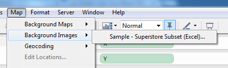 OK, we've got all the pieces we need, now to put it all together. First lets get the background image in place. Go to Maps -> Background Images -> Your data source

So, to get around this we need to take a screen grab. There are lots of screen capture programs out there, the one that I favour is the Snipping Tool that comes with Windows 7. You can also use the Windows print screen command to capture the entire screen and then cut it. Whatever tool you use its important to get all of the dashboard in the capture.
For this example i will use the print screen command in windows.
Get the Tableau dashboard on screen and hit SHIFT-PRT SCR
Now, nothing will appear to happen but Windows has just copied the entire screen to the clip board.
Open MS Paint
Again you can use any paint program that you have. Open MS Paint and hit CRTL-V to paste the clipboard into the program. You will then get the entire screen contents as an image. If you use a dual monitor then you will get both screens so the bit you want might be on the other half.
We now need to crop the image to just show us the dashboard.
Use the select tool to put a rectangle around the dashboard.

At the bottom of the screen it tells you the size of the selection so you can make sure that your crop matches the size of the dashboard, in this case its 800x600
Once you have the selection select crop and you know have your dashboard image. Save this can call it splash.
Put the splash image into Tableau
In order to use this splash image we need to use it as a background image.
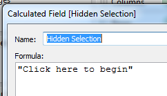
Open up your workbook and create two calculated fields, called X and Y, each with the value 1
We also need to create another calculated field to act as a button to switch to the real dashboard.
OK, we've got all the pieces we need, now to put it all together. First lets get the background image in place. Go to Maps -> Background Images -> Your data source
In the next window we select the splash image that we captured earlier, we then select the X and Y field and set the right value to 2.
Then click on options and tick both the boxes for Always show image and lock aspect ratio.
Click OK and go back to the main screen.
Now we drag the X and Y calculated fields onto the column and row shelf, go to Analysis and untick Aggregate measures and the background image appears.

Add some text explanations
Right click on the axis and untick the headers. In the centre of the pane is a mark, which at the moment is a circle. Drag our "Hidden Dimension" to the Label shelf, change the mark type to text and our "Click to begin" text appears in the centre of the image. Change the size to suit and we have something like this

Put it all together
 Create a new dashboard, call it splash, set the size to the same as the main dashboard, in this case 800x600 and add the new sheet we just created to it. Set the dashboard to show the entire view and test that its lined up OK by flicking between the two dashboards. Ideally it shouldn't move at all but a couple of pixels is fine.
Now for the action, click Dashboard->Actions and add a new filter action. The source should be the splash dashboard and the destination the main dashboard.
You then set the action to work on the Select, untick the sheets and set the target filters to be the selected fields and leave it blank like the image.
Test it
Go to the Splash dash board and click on the "Click to begin Text" and it should flip to the dashboard, and the effect is that the overlay just vanishes. Cool eh.
The last step is to publish the workbook, but make sure that you select the show tabs option so that the flip works, otherwise it opens in a new window and ruins the effect.
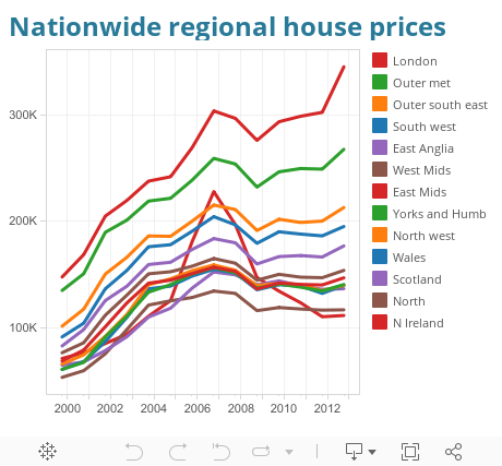
Here's one i prepared earlier